| Pages in topic: < [1 2] | What do you think of my logo? 投稿者: Lise Dufour
|
|---|
Gitte Hoveds (X)
デンマーク
Local time: 04:02
デンマーク語 から 英語
+ ...
| Dark and sinister | Sep 3, 2017 |
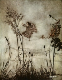
To me it looks like something dark and sinister, the outstretched wing of a raven.
I really, really don't like it. Sorry...
| | | | Lise Dufour 
フランス
Local time: 04:02
スペイン語 から フランス語
+ ...
TOPIC STARTER | Thank you so much! | Sep 4, 2017 |
Thank you all for your input!
The logo is indeed a wing (of a condor, not a raven, as I'm specialised in the Andean world) that I intended to make look like a book.
Some of your comments pointed out something I was already worried about: that it might look a bit sinister. I've just tried changing the color, using the same blue as in the rest of the website, only a bit darker. Let me know if you like it better now
... See more Thank you all for your input!
The logo is indeed a wing (of a condor, not a raven, as I'm specialised in the Andean world) that I intended to make look like a book.
Some of your comments pointed out something I was already worried about: that it might look a bit sinister. I've just tried changing the color, using the same blue as in the rest of the website, only a bit darker. Let me know if you like it better now
Thank you Nathalie for spotting that typo. I've corrected it. I'll take into account your comments about my website in general. I was not very happy either with the brown parts. I'll see what I can do about it… ▲ Collapse
| | | | Juan Jacob
メキシコ
Local time: 20:02
フランス語 から スペイン語
+ ...
...I was right, it's a wing! Bingo.
Difficult to see the relation with translation, though.
Luck.
| | | | CafeTran Training (X)
オランダ
Local time: 04:02
Michael Joseph Wdowiak Beijer wrote: Linguisticano wrote:
Looks like a porcupine or a hand with 6 fingers.
What is it supposed to be? I kind of like it, but the bottom bit is too short.
I agree. And I like the windmills in the background more.
| | |
|
|
|
Your logo seems pretty nice.
And what's more important, it's minimalistic and flat, and that's what's considered modern today.
| | | |
Yes, it looks better in blue, though not the colour of a condor's wing, and other changes seem to have improved it since I last looked some time ago.
I don't think much of considering ravens as sinister though, or condors, vultures, etc.
| | | | Mario Chavez (X)
Local time: 22:02
英語 から スペイン語
+ ...
| Wing or flipped book pages? | Nov 26, 2017 |
Lise Dufour wrote: Thank you all for your input! The logo is indeed a wing (of a condor, not a raven, as I'm specialised in the Andean world) that I intended to make look like a book. Some of your comments pointed out something I was already worried about: that it might look a bit sinister. I've just tried changing the color, using the same blue as in the rest of the website, only a bit darker. Let me know if you like it better now Thank you Nathalie for spotting that typo. I've corrected it. I'll take into account your comments about my website in general. I was not very happy either with the brown parts. I'll see what I can do about it…
Lise, the logo is confusing. If it is meant to be an outstretched wing, it looks clipped. Nothing sinister, just truncated. On the other hand, if it is meant to look like the flipped pages of a book, the wing would have to be stylized. There are dozens of good examples on the WWW done by professional logo designers.
Who designed your logo? To be honest, it looks very amateurish.
| | | | Mervyn Henderson (X)
スペイン
Local time: 04:02
スペイン語 から 英語
+ ...
| All I can see ... | Nov 27, 2017 |
... is a cat sitting on a keyboard. Does that mean CAT tools? I can't see any wings or anything like Tom's hands with black nail varnish (I mean, of course, the hands with black nail varnish Tom posted). Ooh, but I'd like to, though ...
| | |
|
|
|
Mervyn Henderson wrote:
... is a cat sitting on a keyboard. Does that mean CAT tools? I can't see any wings or anything like Tom's hands with black nail varnish (I mean, of course, the hands with black nail varnish Tom posted). Ooh, but I'd like to, though ...
You need to remove the trailing dot from the URL. Proz cannot 'understand' that a URL ends just before a sign when there is no space.
| | | | Mervyn Henderson (X)
スペイン
Local time: 04:02
スペイン語 から 英語
+ ...
| Thanks Thomas ... | Nov 27, 2017 |
... doh! I see it now. But I must say I preferred the cat. And I don't like cats much, so if it worked for me, it'll work for others. Go for the cat, I'd say. Or just the cat's paws or something. With a tag saying "No pussy-footing around here, people".
| | | | Hanna Sles (X)
米国
Local time: 05:02
英語 から ウクライナ語
+ ...
| logo for a freelance translator website | Nov 28, 2017 |
If it is still relevant, I would like to share a post where I wrote and made a video how to make a logo for a freelance translator website from a scratch without paying a penny
https://www.hannasles.com/freelance-translator-logo/
| | | | | Pages in topic: < [1 2] | To report site rules violations or get help, contact a site moderator: You can also contact site staff by submitting a support request » What do you think of my logo? | Wordfast Pro | Translation Memory Software for Any Platform
Exclusive discount for ProZ.com users!
Save over 13% when purchasing Wordfast Pro through ProZ.com. Wordfast is the world's #1 provider of platform-independent Translation Memory software. Consistently ranked the most user-friendly and highest value
Buy now! » |
| | CafeTran Espresso | You've never met a CAT tool this clever!
Translate faster & easier, using a sophisticated CAT tool built by a translator / developer.
Accept jobs from clients who use Trados, MemoQ, Wordfast & major CAT tools.
Download and start using CafeTran Espresso -- for free
Buy now! » |
|
| | | | X Sign in to your ProZ.com account... | | | | | |